Role
Lead UX/UI Designer
Timeline
Nov 2021 - Oct 2022 (1 year)
Responsibility
End-to-end UX/UI design
Beyond Control
Redesigning Hitachi AC control UX by leveraging emotional hook to increase engagement

Since its global launch in 2019, airCloud Home has enabled residential users to control their ACs remotely. By 2021, the product had fallen behind in both functionality and visual design, especially as competitors introduced more polished and emotionally engaging experiences.
As part of a broader initiative to modernise the Hitachi Cooling & Heating ecosystem, we set out to redesign the app and expand its role beyond utility into a lifestyle companion.
Project Outcome
Introduced a new home-screen feature that earned strong stakeholder and user support
Delivered a refreshed UI with reusable components suitable for future design system work
Won an iF Design Award 2024 for its user experience design
The Problem
Fast-following with no true value to customers or the brand
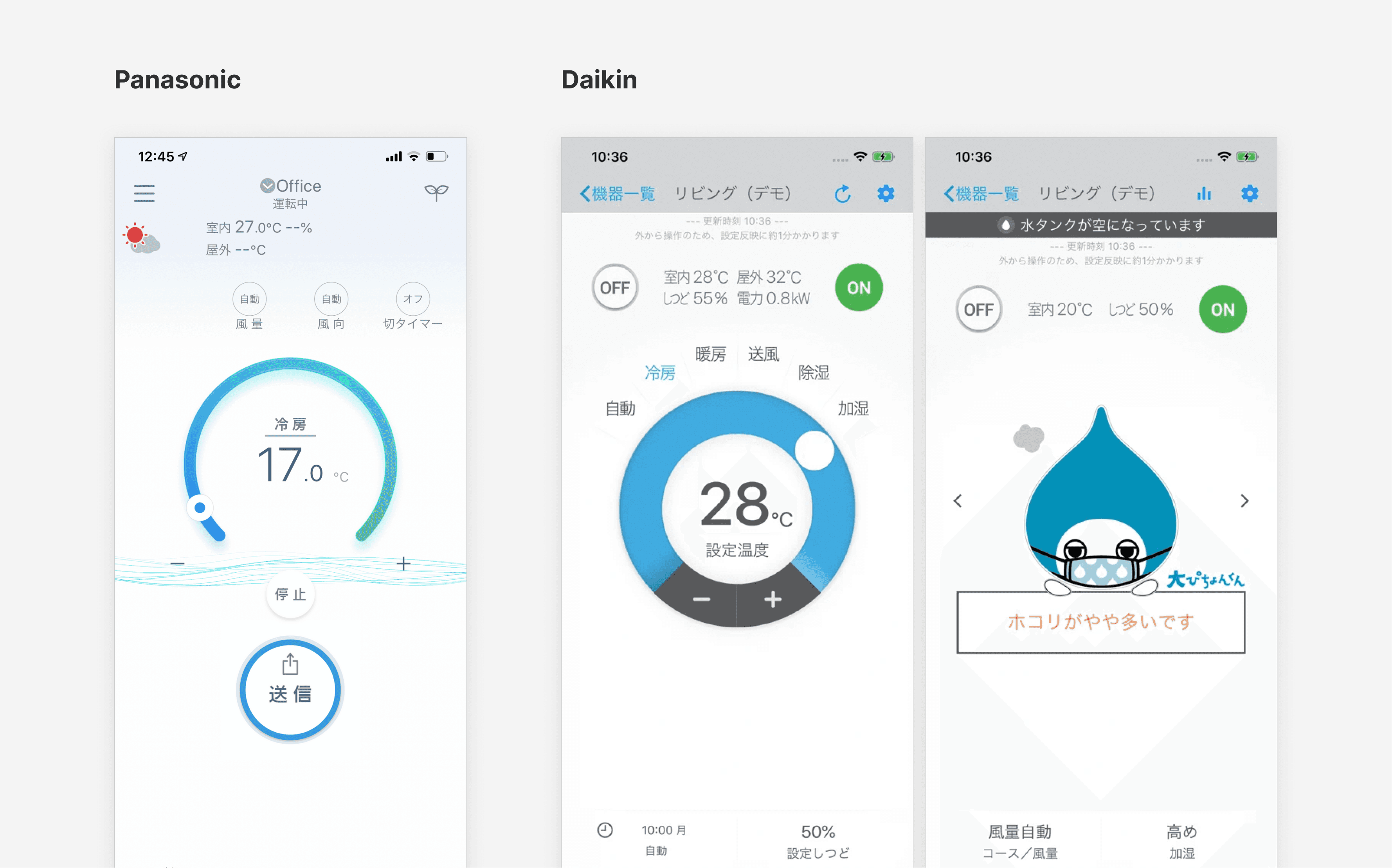
The original airCloud Home app, developed in 2018, was a fast-following response to market competition. It did not reflect Hitachi’s global visual brand language and lacked emotional resonance. The UI felt unstructured and inconsistent, contributing to user confusion and limiting long-term engagement.

Competitors such as Daikin and Panasonic had already invested in improved interfaces and richer functionality. Although our roadmap included many new features, the app still lacked a core value proposition that differentiated Hitachi in the growing IoT category.
The Challenge
Creating an emotional hook within a scalable, globally adaptable design
We saw an opportunity to redefine what an AC control app could be by introducing an element of emotional connection while modernising the interface.
The challenge was twofold:
Introduce an emotional hook
The app was primarily seen as a remote control. To stay competitive, we needed a feature that added meaning and delight to everyday use.Design for global scalability
The China version would be the first launch, but the solution needed to work across regions and become the foundation for Hitachi’s next-generation AC control lineup. The design had to support localisation and accommodate regional differences without fragmenting the experience.
Hitachi’s mascot, Shirokuma-kun, emerged as a strong candidate to support this emotional layer.

Personal Highlights
From leading research and design to leveraging product analytics to drive ROI
Conducted user research with 300+ survey responses to understand regional visual and feature preferences
Designed and delivered a new home-screen feature to support the visual refresh and improve business KPIs
Led the China app redesign and coordinated closely with vendors on UX and content
Planned and executed usability testing to guide iteration
Developed reusable UI components to support a sustainable, scalable design approach
Aligned internal teams around analytics adoption across the IoT portfolio
Facilitated workshops to support stakeholder understanding of Amplitude and data-led decision-making
User Research
From survey to usability testing, we bring the impact of design value to business
Research played a central role throughout the project. I collaborated closely with regional teams, vendors, and stakeholders—conducting surveys, guiding prototype development, and leading usability test sessions.
Early regional insights helped inform visual preferences and feature expectations, while usability testing uncovered unexpected behaviours that significantly shaped our interaction patterns. This end-to-end research approach not only improved the design but also supported broader conversations within the organisation about the value of user-centred product development.


Design Constraints
From pushback to next steps
During design exploration, we learned that Shirokuma-kun could not be used for weather forecasting due to patent restrictions. Creating a new mascot for the China market was explored, but cross-team alignment across branding, marketing, and legal was not feasible within the launch timeline.
To keep the release on track, we introduced simple weather animations as an interim solution. This allowed us to maintain clarity in the experience while meeting the needs of the initial launch.

The Solution
UI Design
The refreshed interface aimed to modernise the overall experience and introduce a warmer, more approachable visual language. Key screens were redesigned with simplified layout structures, refined controls, and a more cohesive styling approach. The new home-screen feature served as the primary emotional anchor, helping differentiate Hitachi’s offering while staying functional and clear.


Impact & Recognition
Impact that moves the product forward
The redesign increased user satisfaction and engagement by 20% and established a reusable component set that now supports future products across the Hitachi Cooling & Heating IoT portfolio. The project also received an iF Design Award 2024, recognising the strength of the refreshed experience and the value of the underlying design foundation.

Key Takeaways
What I learned
Drive open communication
With tight timelines and limited resources, frequent communication helped maintain alignment and build trust in the direction of the work.
Use data to strengthen design maturity
Research insights were critical in a low-maturity environment, helping stakeholders understand the value of a design-led approach.
Fail early to learn faster
Usability testing surfaced a critical temperature-adjustment issue, allowing us to refine the experience before development and avoid costly rework.